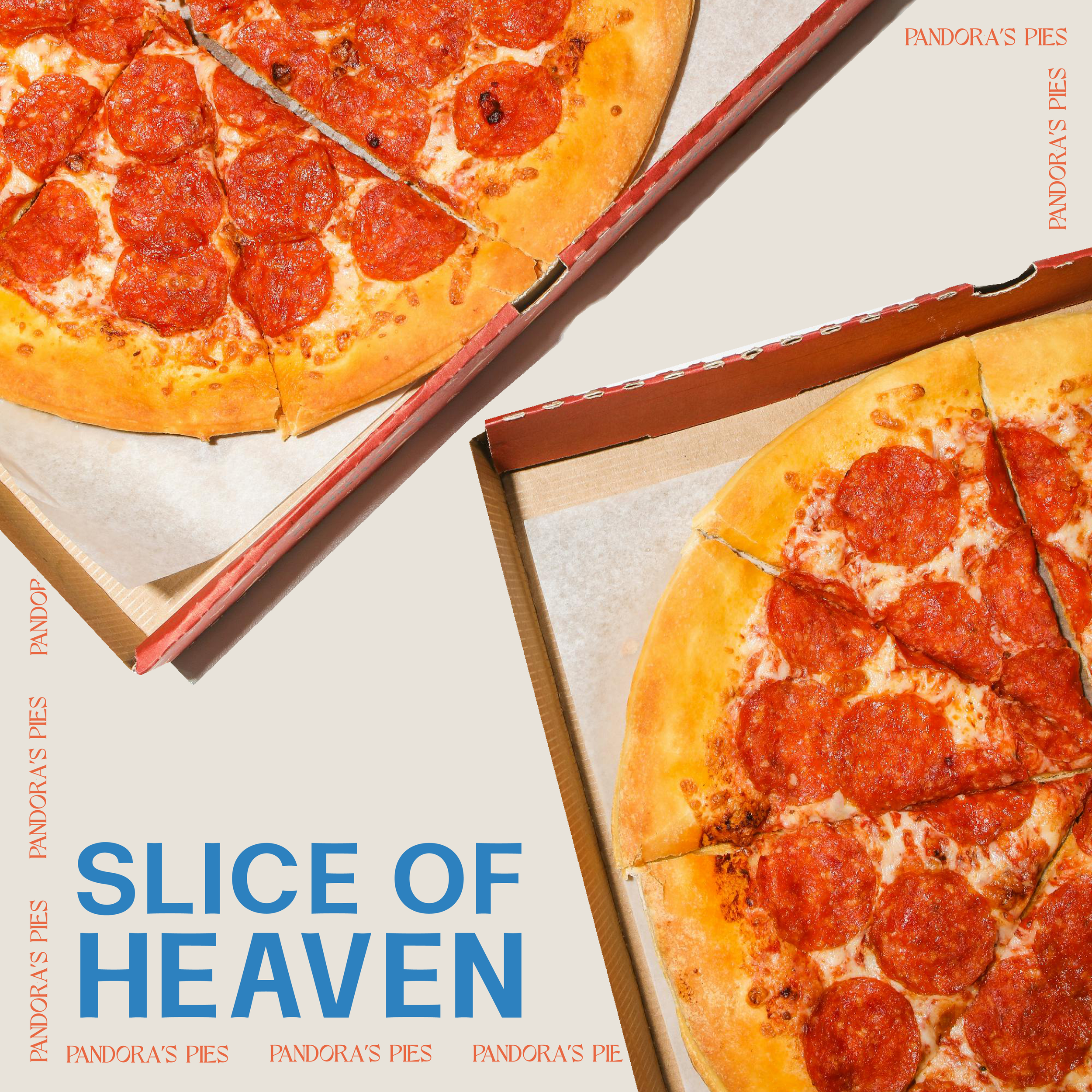
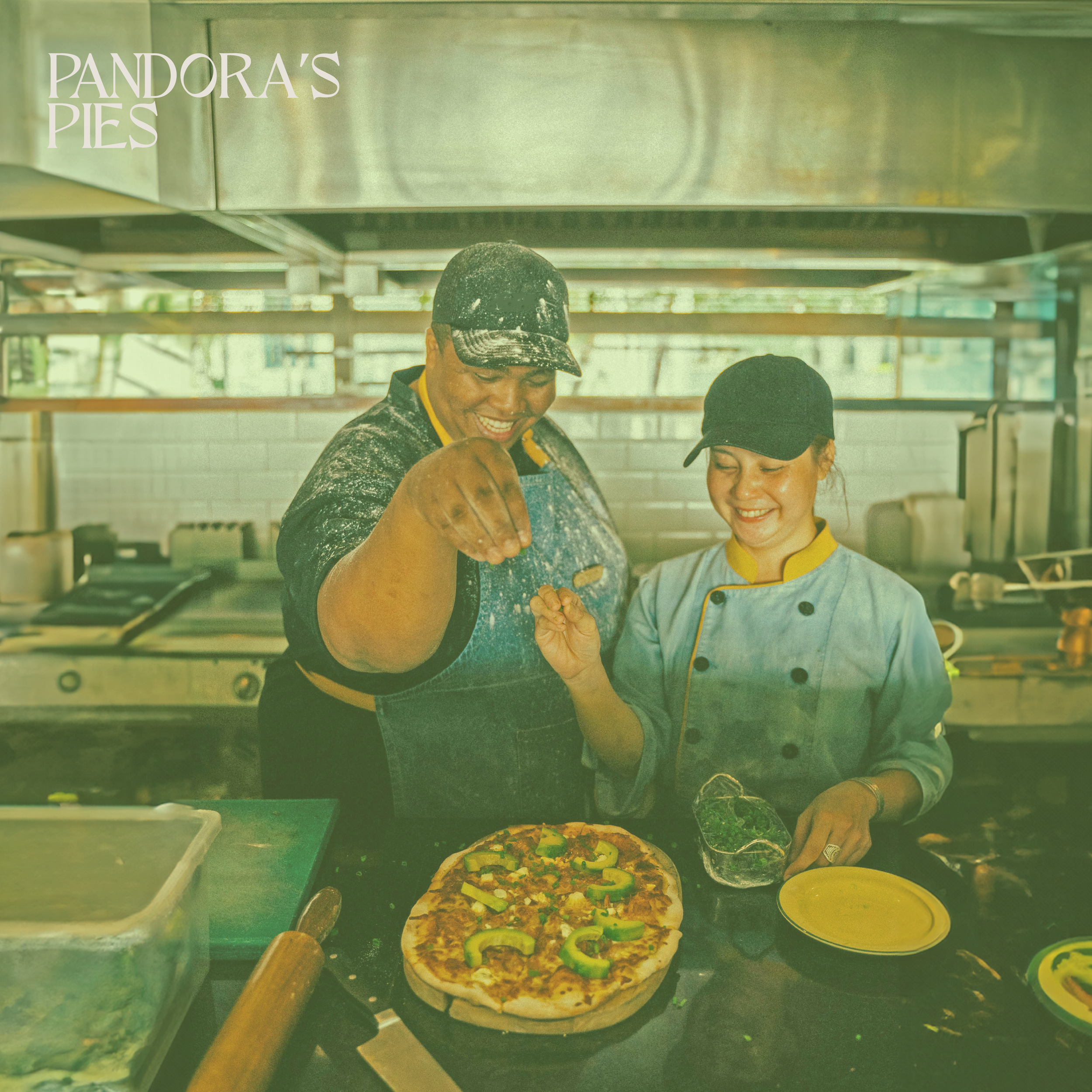
Pandora's Pies Rebrand
Pandora's Pies is a locally owned restaurant located in Elon, North Carolina. This project stemmed from my work as the Director of Creative Production at Live Oak Communications, where we used this business as a part of our hiring process. This project centered around leveraging the symbolism of Pandora's Box and Greek mythology to craft new logos, color schemes, fonts, and promotional materials. The aim was to subtly integrate elements of classical Greek symbols into the restaurant's identity while emphasizing its local appeal and handcrafted pizzas.
THE ASK
Revitalize the apperance of a locally own resturant to drive a younger client base.
THE Challenge
Merge the timeless essence of Greek mythology with modern design elements, revitalizing Pandora's Pies for it’s local audience: college students.
THE Solution
A reimagined brand identiy that evokes a feeling of warmth, community, and authenticity.
Primary Logo
A text-only logo uses the primary font that emphasizes the restaurant's name with a homemade, artisanal feel that is reminiscent of Greek culture.
Secondary Logo
The secondary logo pairs my primary font with an illustrated pizza slice, blending simplicity and playfulness to represent Pandora's Pies.
Alternative Logo
Featuring a half-pizza illustration wrapped in text, this logo merges art and typography to showcase the restaurant's product and purpose.
Color Palette
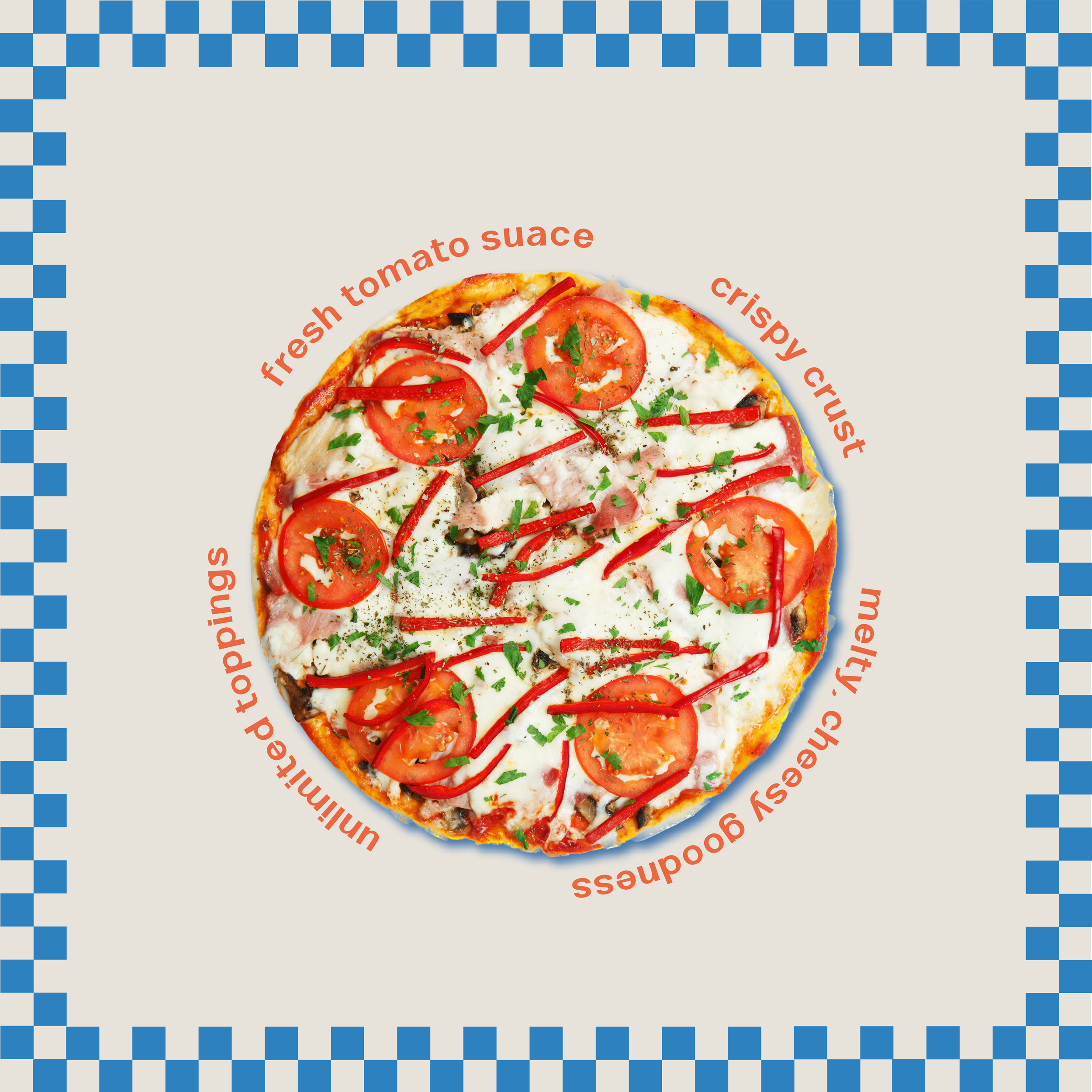
The color palette for Pandora's Pies was selected with the goal of merging Greek aesthetics and the ambiance of a traditional pizzeria. The green, blue, and tan were inspired by Greece's colors, symbolizing the sea, landscapes, and ancient architecture. In contrast, the orange, yellow, and brown echoed the warm, comforting tones often found in pizzerias.
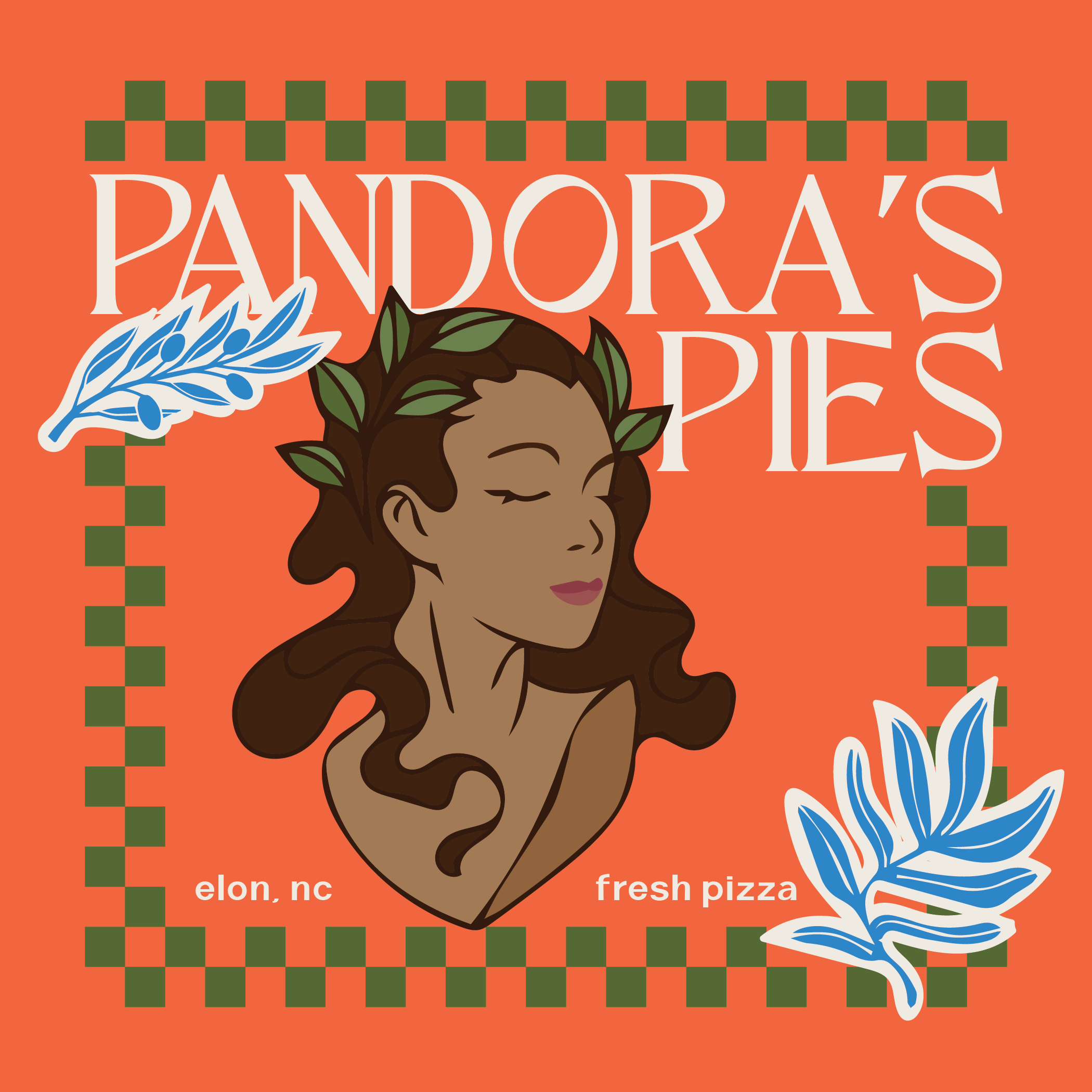
Pizza Box Design
The pizza box is one of my favorite parts of this redesign, as I feel it best represents the inclusion of Greek culture in this redesign concept. Featuring an illustration of Pandora, who is the first human woman according to Greek mythology, the pizza box draws inspiration from the statues seen in ancient Greek art. The illustration depicts her with a laurel wreath, historically worn in Ancient Rome as a symbol of triumph. To further evoke Grecian elements, I incorporated illustrations of plants native to the country, including an olive branch. The bright orange color from the palette was strategically used to evoke the feel of a traditional pizzeria, complemented by a checkered pattern, lending a nod to the classic, Italian pizzeria.